Many website builders provide beautiful templates that are already built with user experience in mind, but there are always things you can do to further improve the user experience on your website.
In this article, you'll find 10 tips to improve the user experience on your website and the details on how to implement each one.
1. Keep Things Simple
Above all else, your website needs to be easy to navigate, and visitors should be able to instantly identify your product or service.
Flashy design can be impressive, but it defies its purpose if it makes it difficult for users to find what they're looking for. The same is true for your main message—visitors should be able to immediately figure out what you're offering and what's in it for them.
Stick to a clear main message and a simple menu structure, where users can easily browse through your products or services, find the "About Us" page, or contact you.
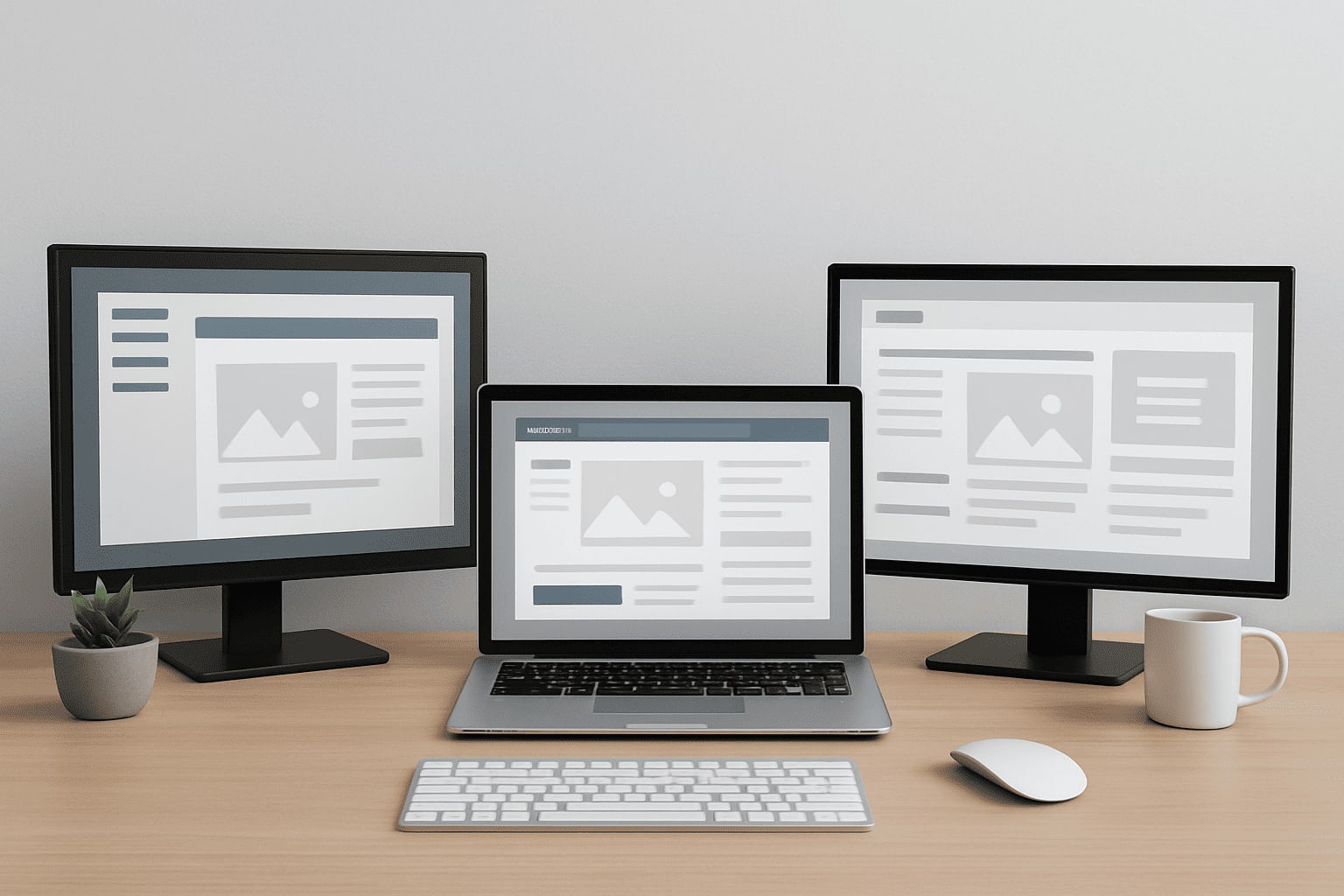
2. Use the Same Design for All Pages
To build familiarity and help users find their way around your website, use the same design structure across all pages.If your menu is on the left side, keep it there across all pages. Product pages should also look similar, so make sure your "Add to Cart" button is always located in the same place and that your product descriptions feature the same information and look consistent.
3. Use a Flat Website Structure
Using a flat website structure, where all pages are accessible within a maximum of four clicks, enables users to find their way quickly and not get distracted or lose interest. This makes all your content easily discoverable and helps you ensure that there aren't any parts of your website that are difficult to access.
Of course, the more information (or products) your website contains, the more complex its structure will be, but it's still a good idea to use a flat structure with highly descriptive categories.
4. Optimize Your Website's Loading Time
If your website is slow and sluggish, even the most beautiful design won't stop your users from leaving—in fact, many will not even have the patience to see it. If a website takes more than five seconds to load, the probability that users will bounce (that is, leave the page) increases by 90%.
For this reason, you need to make sure your website loads fast. Get rid of all elements that slow your website down, even if they look pretty. Remove large images and heavy plugins, and use a hosting service that is optimized for speed. Many of the best web hosting solutions will offer such an option.
5. Use White Space Generously
White space drastically improves the user experience and helps the different elements of your website stand out, so use it generously. Don't be tempted to use all the available space you have: if a website's design is too crowded, it'll feel confusing, and users will simply leave.
Use white space strategically, for example, around your key message above the fold or around headlines and buttons.
6. Make Sure Your Website Is Mobile Friendly
Mobile traffic accounts for nearly 60% of all traffic globally and is steadily growing. For this reason, to provide a positive user experience to your visitors, you need to make sure your website is optimized for mobile. This will have an impact both on UX and on your rankings in search results. Remember, mobile optimization is critical for SEO.
If you're using a website builder like GoDaddy or HostGator, you'll have access to extensive libraries of templates that are optimized for mobile. In this case, you won't need to do anything extra beyond testing your website across a few different browsers and devices (mobile phones and tablets). Don't forget to also test for both dark and light mode.
7. Make Your Content Easy to Scan
With the average time of 52 seconds spent on a page, most visitors won't read all content on any given page. Therefore, to provide a good user experience, it's essential to make your content quick and easy to scan.
Use bullet points and bold text to draw readers' attention to specific information. Use buttons for your most important calls to action, and make sure your links are easy to identify by using hyperlink differentiation.
8. Add Clear Calls to Action (CTAs) on All Pages
Each page of your website should have a clear call to action, nudging users to do something specific. This gives them a clear sense of direction, informs them about the next steps, and drives them through your sales funnel.
Your CTAs should be short and clear. Not all CTAs need to be buttons, but the most important ones do (for example, "Buy now" or "Work with us").
Here are a few more examples of CTAs:
- Find out more
- Make a reservation
- Add to cart
- Subscribe to our newsletter
- Contact us
- Book a meeting
9. Ask for Minimal Information
If you make your users jump through too many hoops and fill in endless forms, they'll simply give up. Users don't like giving out too much information, so whatever you want them to do, only ask for details that are strictly necessary.
For example, to subscribe to your newsletter, only ask for an email address—and maybe a first name. Checkout should also be straightforward and, if possible, not require creating an account or giving too many personal details.
If you're using gated content to generate leads, you might want to get more information from your visitors, but you should still try to keep it to a minimum. The best marketing tools will help you navigate lead generation and collect customer information in a non-intrusive way.
10. Use Colors and Fonts That Are Easy to Read
Colors and fonts significantly impact the user experience, so make sure you use ones that are easy to read.
The goal when choosing a font shouldn't be that it's unique or pretty but to allow users to read your content without too much effort. The same goes for colors.
Arial, Helvetica, Georgia, Lato, and Montserrat are some examples of fonts that are easy to read. Use contrasting colors to make the reading experience easy on your visitors' eyes.
Provide a Stellar User Experience to Keep Users on Your Website
To keep users engaged and have them interact with your website (and hopefully make a purchase), you need to provide a stellar user experience. Make sure your website is easy to navigate and has a clear main message and plenty of white space to attract the eye to the most important calls to action on each page.
And if you need help with building your first website, you can use one of the many small business website builders available on the market.