- Home/
- Website Builders/
- 10 Web Design Trends to Expect in 2026
10 Web Design Trends to Expect in 2026
January 2, 2023
.20220126140739.jpg)
January 2, 2023
With the best website builders, following modern design trends is super easy. Platforms like Wix and Squarespace come with countless editing tools that you can use to fine-tune the appearance of your site and keep your design modern.
Here, we offer a quick run-through of some of the biggest design trends that we expect to take the digital world by storm this year. Watch out for the following as 2026 progresses.
The use of simple black and white color schemes appears to be becoming increasingly widespread among adventurous designers. They let you contrast elements without having to worry too much about the colors you’re using. And they’re super useful for basic sites without a large amount of visual media.
If you’d like to go a step further, you can use a predominately black-and-white color scheme with a couple of extra colors to highlight important elements. This is particularly useful when you’re trying to encourage your visitors to perform very specific actions.
Most website builders appear to have identified this trend, adding loads of black-and-white templates. Wix, for example, has quite a few templates built specifically for greyscale design. It also enables you to transform virtually any of its themes into a black-and-white website.
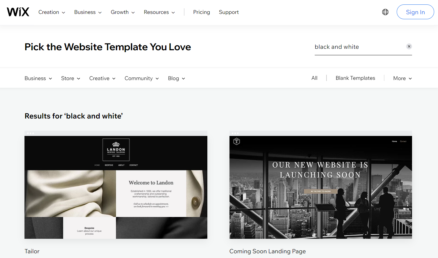
Image credit: Wix
As web design tools become more and more advanced, we can expect techniques like animated typography to become increasingly popular. In the past, these advanced looks could only be created by highly skilled coders, which means that they never really caught on and became mainstream.
But in 2026, we expect more beginner-friendly website builders to add animated typography tools that require no coding or advanced technical knowledge. Platforms like Wix already have them, but we look forward to seeing which other builders follow its lead.
When they do, we’d highly recommend adding some form of animated typography to your website. When used correctly, animations are great for drawing a viewer’s eyes to a particular part of your page.
Want them to read something before they begin scrolling? Make it jump out at them. Want to make sure they don’t miss an important section of your article? Make the subheading do something funky.
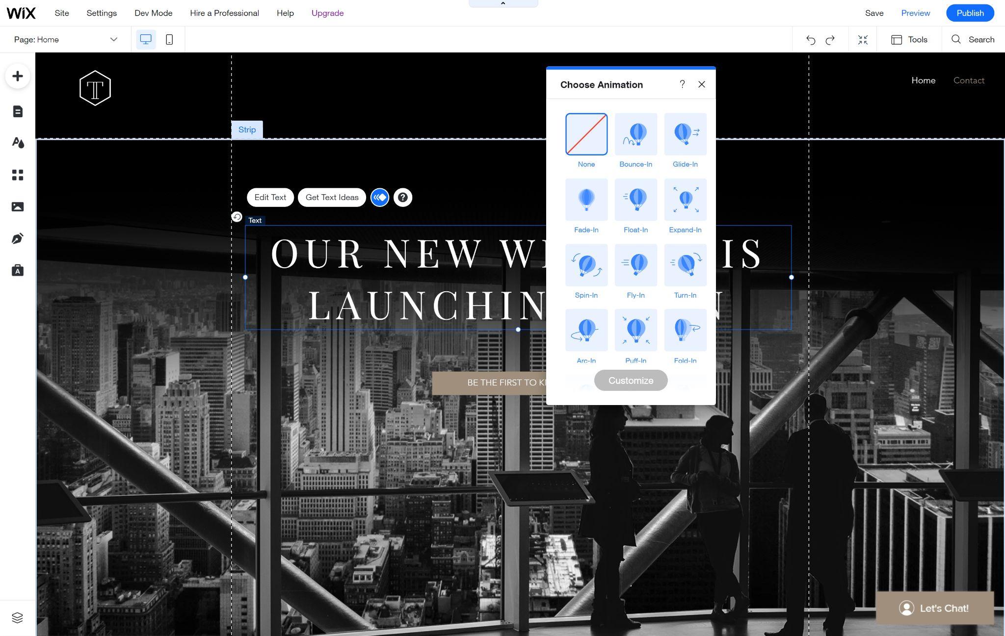
Image credit: Wix
Everywhere you look, the retro design trends of the 70s and 80s are beginning to return. Clothing styles have gone a full loop, retro art has become popular again, and even retro game animations can be found everywhere you look. Web design is a little different though.
This is because retro web design has never been a thing!
But it’s fast becoming one. Well-performing sites across the web use pixelated, retro visuals, and we love it. We expect loads of new websites to adopt this look as we move through 2026.
As a quick example, we looked at the WordPress theme library. A quick search for retro delivered a number of excellent themes, including a few that we’re super keen to test ourselves!
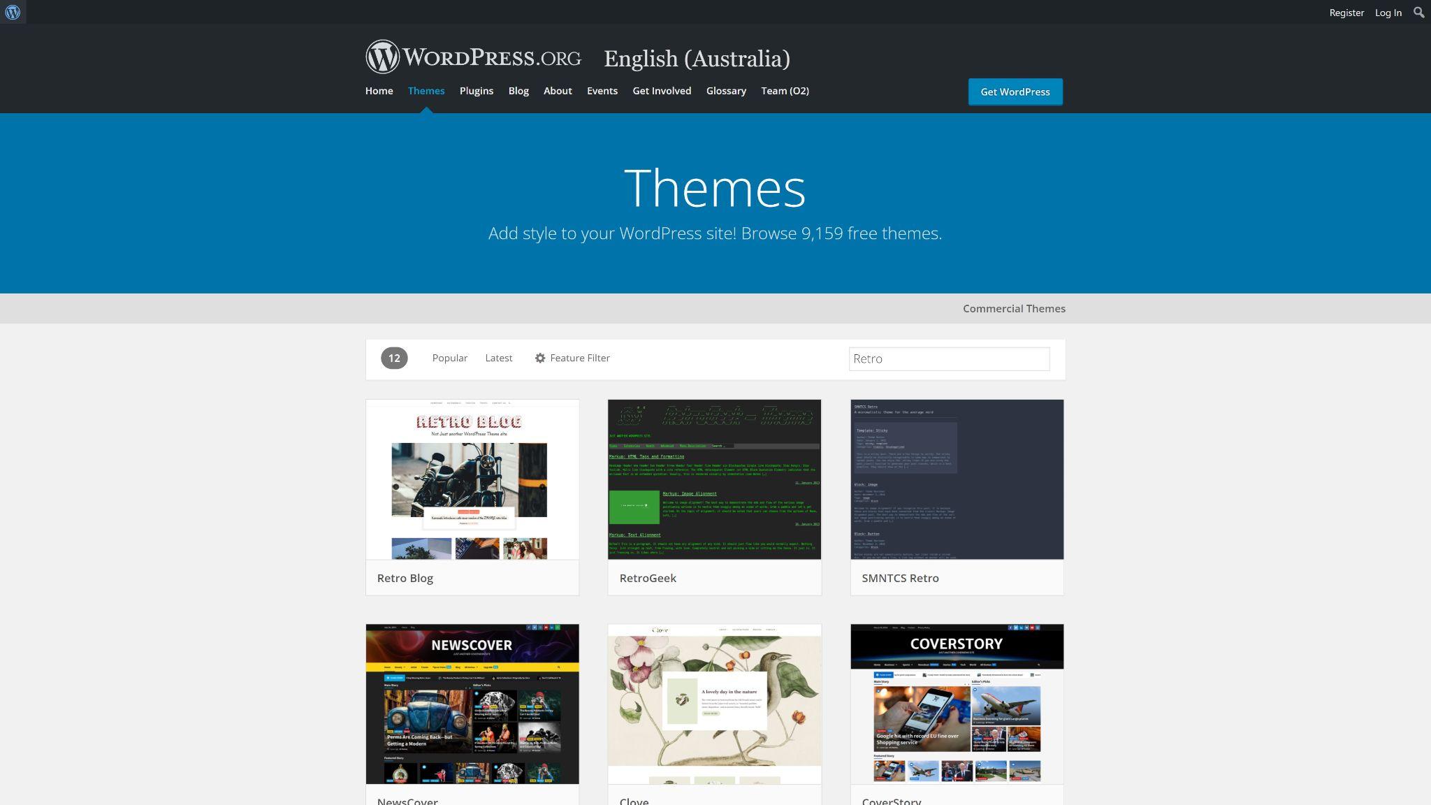
Image credit: WordPress.org
You’ve heard the old saying that “a picture is worth a thousand words”, right? This still holds true in most settings, but there’s a growing design movement that removes this reliance on visual media.
Instead of using images and other graphics to direct the eye and encourage a reader to stay on their website, many developers are turning to design and layout principles. By presenting your words in the right way, you can make them have an immediate effect without a distracting image.
Take the example of the SVZ website that Webflow showcases as an exact example of this technique. Images and other graphics are almost entirely absent, yet the designer manages to convey meaning and engage the reader through the use of abstract shapes and colors.
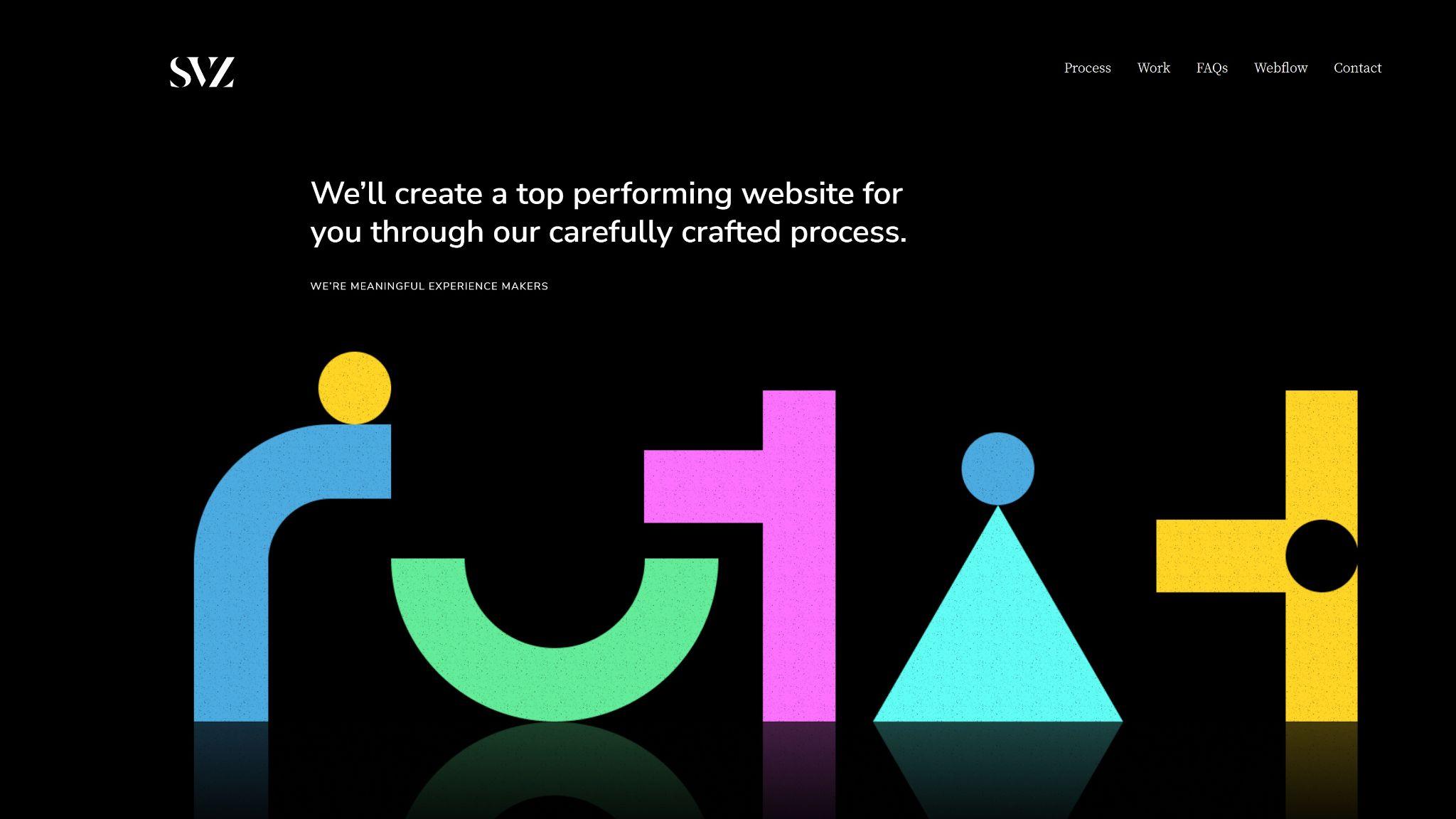
Image credit: Webflow
Memphis design has been around for decades, but it looks set to make a big comeback in 2026. Over the past few years, webmasters across the world have been using Memphis design principles to create attractive, converting websites that have performed surprisingly well.
But what is Memphis design, you ask?
Basically, the principles of Memphis design were developed in the 1980s by the Memphis Group, a furniture design company that wanted to protest against boring modernist and minimalistic principles.
It embodies the abstract and colorful. Websites designed with these principles tend to be explosive, adventurous, and when done right, extremely successful.
Over the past few years, minimalistic design has been quite popular. But it’s almost had its time, and it seems that every other website follows the same basic principles. We expect Memphis design to grow rapidly as people look for attractive alternatives.
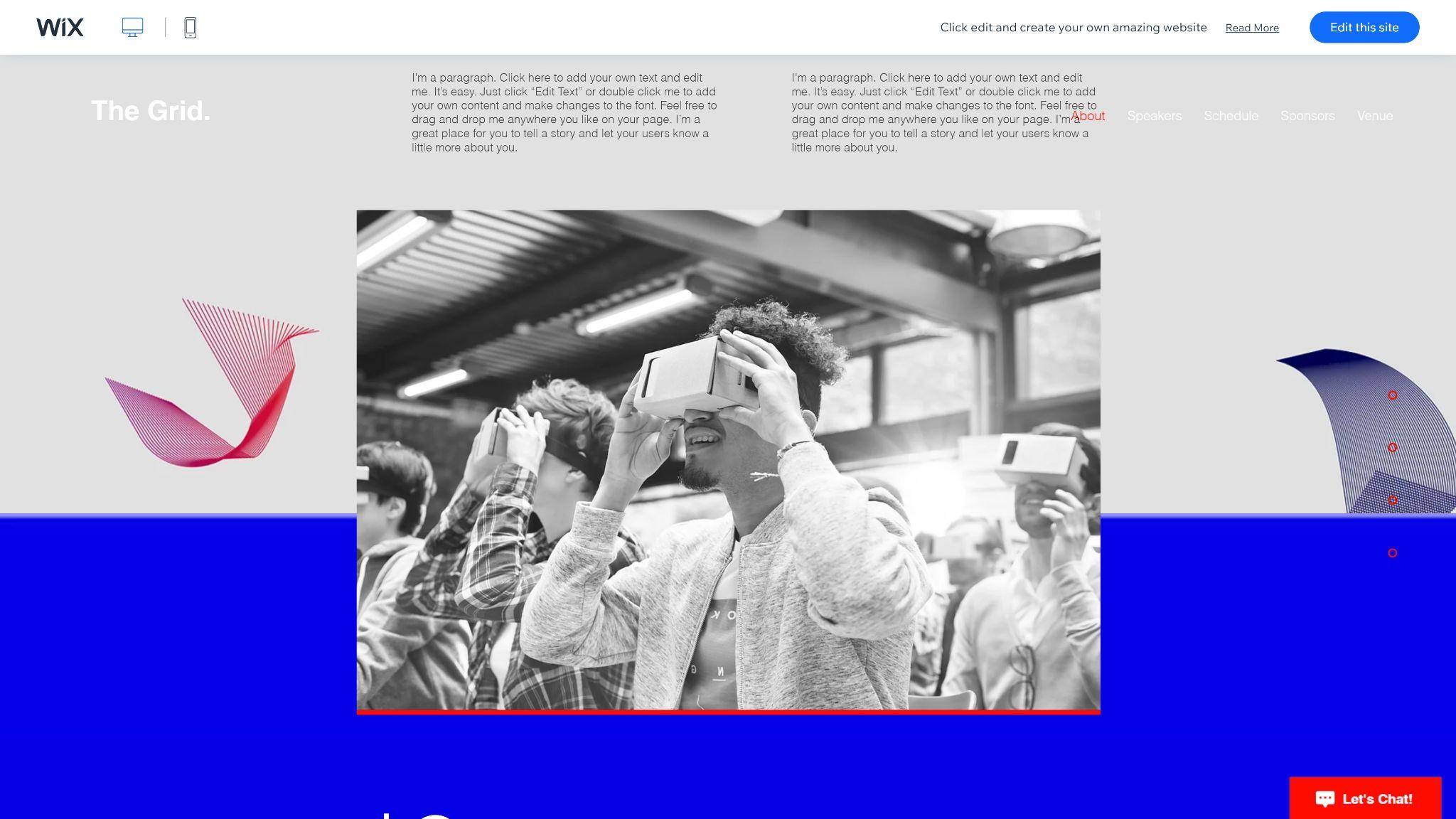
Image credit: Wix
Like a few of the things on this list, 3D elements have been around for a long time. But they have never really caught on, as a significant amount of coding experience was required to create them.
But we’re beginning to see 3D design tools added to various website builders, opening them up to developers of all skill levels. By adding 3D elements to your site, you can really create a stunning design that people won’t be able to get enough of.
Some platforms, like Wix, offer specialized 3D templates, while others enable you to add interactive or moving 3D objects.
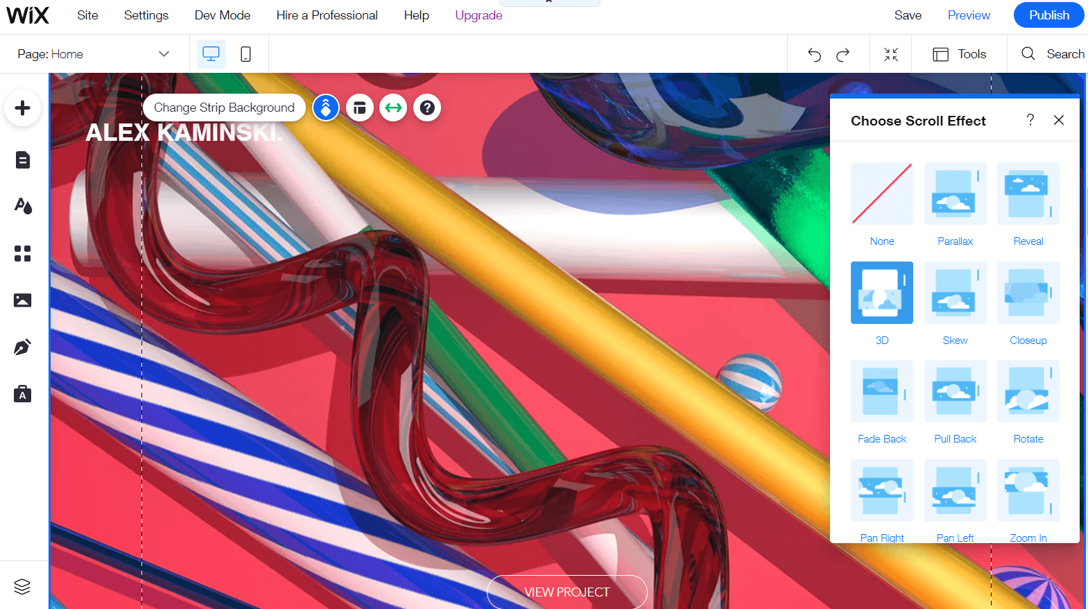
Image credit: Wix
A large number of websites have begun to adopt split screen designs, which enable you to present information in a visually appealing manner. Loads of templates with this type of layout are being released, and we expect it to really take off in 2026.
In most cases, split-screen layouts are used to present an image or graphic alongside a related block of text. It’s often seen on software or business websites, where it’s used for things like outlining features and selling points.
Image credit: Wix
This may come as a surprise, but many websites targeting a younger audience are taking advantage of bright colors to help engage people with a poor ability to focus. Bright colors tend to draw people’s eyes more, and some audiences are more likely to stay on a page if they’re visually stimulated.
For example, a lot of modern musical websites make use of neon colors, harsh contrasts, and hippy shapes.
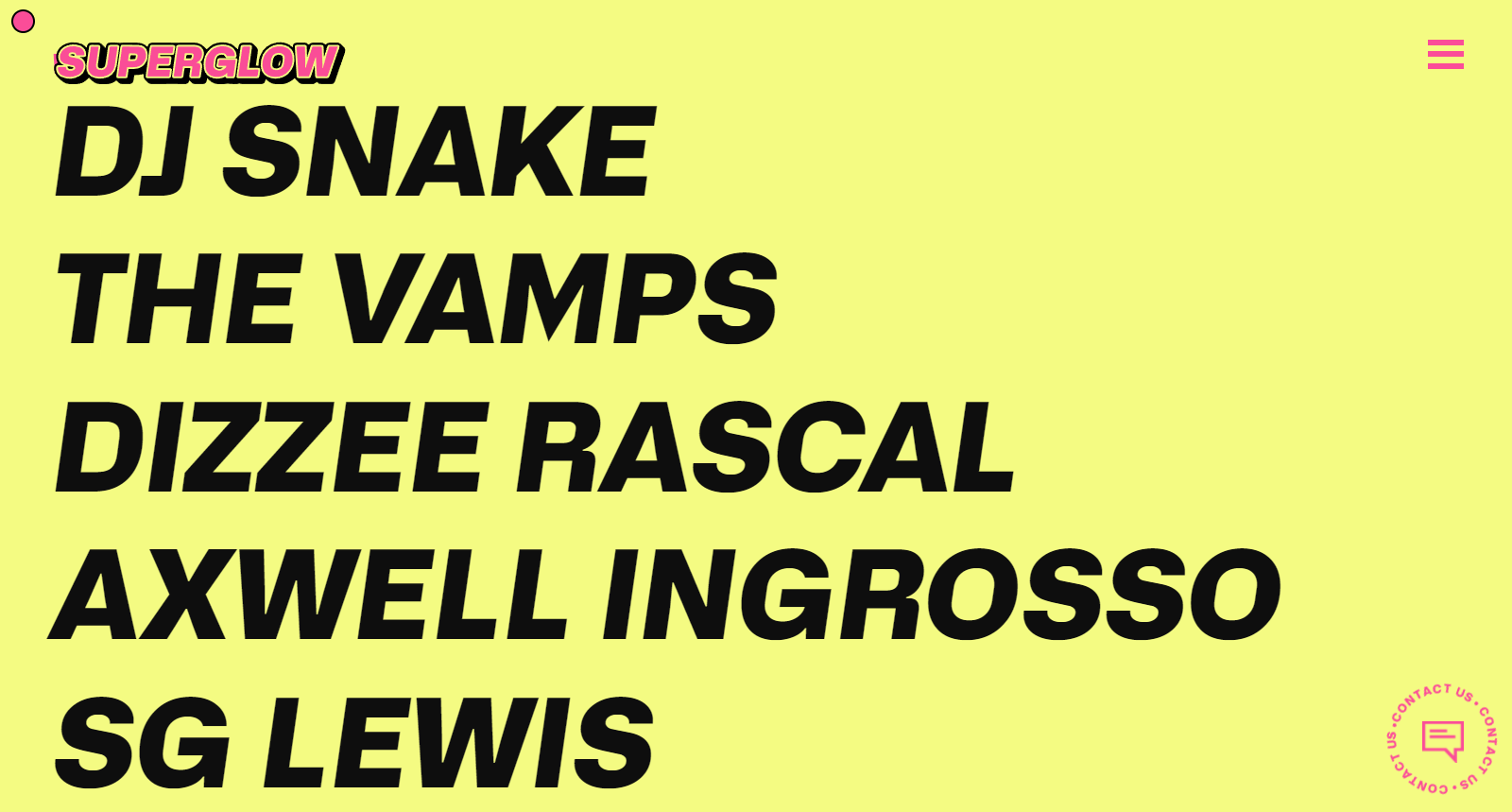
Image credit: Superglow
Brutalism is a design trend that has been around for a while but has never really caught on for websites. And we don’t really expect it to, because it’s just too harsh and in your face for most.
But what we do expect to catch on is a milder version of brutalism, which is already being termed “almost brutalism.” Most designs with this style have a bulky, almost clunky look to them, and they’re considered the opposite of minimalism.
Brutalist typography is also something we’ve been noticing more and more recently. Like general brutalism, it uses bold, rugged designs to direct a reader’s eyes. Have a look at the example in the screenshot below, and you’ll understand.
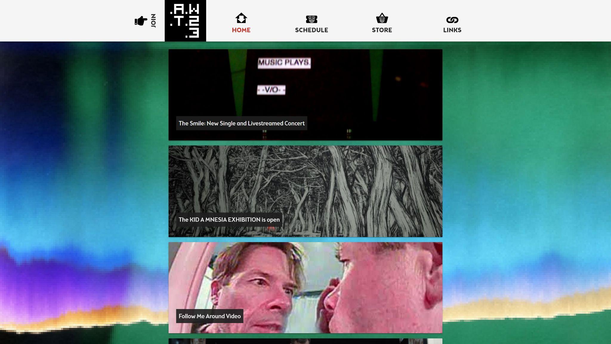
Image credit: W.A.S.T.E. Headquarters
Any web designer worth their money will tell you not to pack your headers or footers full of unnecessary information. But despite this, we’re seeing a rapid rise in the use of what has been termed “mega footers”.
Basically, these go against modern design trends by presenting a wealth of links and content for the viewer to consume. But why are they becoming so popular?
Well, they enable you to concisely present a large amount of information in an easy-to-consume manner. When they’re well designed, they aren’t complicated, and they provide a larger navigation menu than the main header menu. You may also find contact forms, social media links, and other elements depending on the type of website.
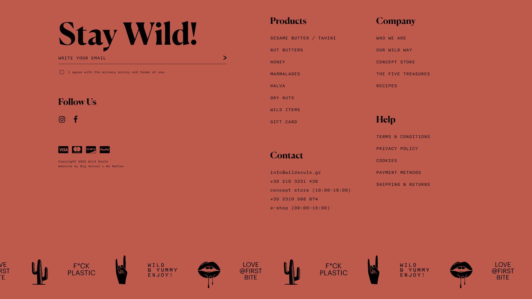
Image credit: Wild Souls
Like everything, web design trends are constantly evolving, and new ones arise every year. Here, we’ve outlined a few that we expect to take root in 2026, and we’d suggest having a close look at them to ensure you stay ahead of the game.
Expect retro styles to become widespread, Memphis design to continue increasing in popularity, and bright neon colors to pop up all over the place. Design elements like mega footers, 3D visuals, and animated typography will be used more often, and it’s likely that you will begin to see more black-and-white websites.
But the most important thing to remember is that you need to design a website that’s right for your content and audience. The above trends might help, but they also might not work for you.
Daniel Blechynden writes for Top10.com and specializes in tech, with a focus on web hosting and website building, personal finance and investing, the sciences, and digital marketing. He holds degrees in Chemistry and Marine Science from the University of Western Australia and has written for a number of leading publications.


