- Home/
- Marketing Tools/
- 10 Tips to Creating a Good Logo for Your Business
10 Tips to Creating a Good Logo for Your Business
May 29, 2023
May 29, 2023
While a good logo helps to raise your reputation, increase brand recognition, and establish your business among competitors, a bad logo could mean your brand gets overlooked. That’s why it’s important to understand the best practices for creating good logos for business.
While this can feel overwhelming, it’s reassuring to know there’s help on hand. For instance, harnessing the power of one of the best marketing tools like Constant Contact or Sendinblue can help to streamline everyday processes and free up more time for creative tasks, like creating your company brand.
However, if you’re unsure how to get started with the creative design process, read on for 10 tips for creating a logo that will help your business stand out.
You may not have access to a specialist designer within your business, but that doesn’t have to stop you from creating a stunning logo for your brand.
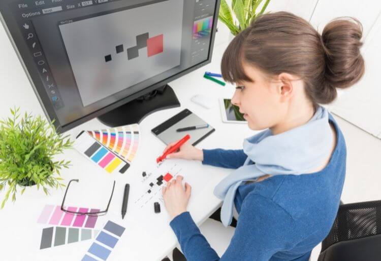
If you’re looking for guidance and assistance when designing, our first tip is to use one of the best logo design tools to simplify the creative process. This can help highlight things like the spacing and scaling of your graphic—which, if you’re not a designer, you probably wouldn’t consider otherwise. If you’re unsure which design tool to pick, read our tips for choosing the best logo design company for your needs.
Before you embark on designing a logo, research your competitors for inspiration on how other brands' logos look. See how their logos evolve over time and make a note of any apparent trends.
CreativeBloq seconds this. Its advice is to research your target market thoroughly before even starting on a concept for your logo design. By thoroughly examining all logos comparable within your industry sector, you may discover certain branding conventions that appear more commonly than others, which can then inspire you to play with familiar visual associations when creating your own design.
A memorable logo is crucial to the success of a business—but it’s not everything. When starting to design, consider your overall brand identity. Your website, content, and marketing materials are especially important, so ensure your logo colors remain consistent with these to keep your branding recognizable.
Consider the colors of your logo carefully. Opting for black and white implies a minimalistic or classic design, while a logo with a single color can help associate that specific shade with your brand (think Coca-Cola).
Alternatively, 2-3 different hues can make your brand look more experimental. But do keep in mind that, regardless of color, your logo should always look good in black and white. According to creative marketplace Designhill, this is a basic design principle and is especially important if your company will be advertised in colorless print.
Utilize the space available when creating your logo, but also remember to give it room to breathe. For instance, if you decide to add a frame to your logo, make sure there’s enough space between the icon, text, and frame. You can always enlarge the frame or decrease the elements within it to add more space.
Another good tip is to play with any white space to potentially create a bigger impact. Take the FedEx logo as a good example of this—if you look closely, you can see that the white space between the E and X depicts an arrow, which cleverly illustrates the brand’s purpose.
Additionally, all elements in your logo should be aligned in the same direction (left, center, or right) while also staying balanced. Pay special attention to symmetry and negative space to keep your logo looking professional.
Creating an effective logo is more than just picking a relevant image and placing your business name on top. Good logos for business simplify visuals to encompass the spirit of your brand. Rather than using an image directly showing what your service is, try to think outside the box about how else your logo can represent your brand.
The Nike logo is a brilliant example of this. Rather than using an image of someone running or a sneaker, the sportswear brand employs the use of the swoosh icon to represent speed and movement. This is both clever and easily recognizable and ties in with the golden rule of logo design stated by Wix: your icon should be simple enough that clients can recall it even after 1 quick glance.
“A brand is not what you say it is, it’s what they say it is,” says Marty Neumeier in his book, The Brand Gap. While your brand logo should endeavor to personify your business mission and values, it’s also important to ensure that it stays appealing and relevant to your target demographic.
To do this, make sure that any images, icons, fonts, or colors used in your design are relevant to your industry and encompass the wants of your target audience. Take the Toys “R” Us logo as an example. It stays representative to its young audience by the notable backward R, playful typeface, and child-like color scheme. This logo is effective because it remains recognizable while also adhering to the brand’s young target demographic.
 (2).20220414072555.jpg)
Do think carefully about your font. We’re not just talking about typeface—consider things like the size, uppercase and lowercase letters, and overall readability.
As your logo will be used across marketing and branding assets, check that the text will be readable wherever it’s placed. Analyze its readability on platforms like Instagram and Facebook, your website, and also on devices like smartphones and tablets.
Additionally, consider the variation of typefaces available, including serif, sans-serif, and script. Consider which font matches your company’s vibe. Should it be clean and serious? Or are you going for something more playful and fun? Think about playing with uppercase and lowercase letters, too. Logos with uppercase letters are renowned for showing a stronger sense of authority, while those with lowercase letters imply a more approachable, casual company.
Taglines are short, punchy phrases that help to summarize the tone of your brand. While it might feel tempting to include as much information as possible, it’s more impactful to shorten your tagline to match the length of your company name. Ultimately, you want to ensure visual balance here—your tagline should be smaller than your name but also perfectly aligned.
Aim for 25-30 characters at most, and consider a thinner, less bulky font for your tagline so that it doesn’t overrun the length of your name. You can also solve spacing issues by adjusting the size of either your name or tagline to make both look the same length.
“A good logo lasts for at least 10 years,” says Alex White in his book, The Elements of Logo Design. While fads come and go, a classic logo will never go out of style, which is worth thinking about if you’re tempted by trends popping up in the design world.
According to Designhill, having to redesign your logo can negatively affect your target audience and their opinion of your brand. You’ll want to create a logo that can stand the test of time.
Keep it classy by sticking to more traditional fonts and by using a maximum of 3 colors. You can always tweak your logo slightly as your business evolves, but avoiding trends and design faux pas will keep your business looking timeless.
A versatile company logo is a strong logo. You want to design something that will look good wherever it’s placed and stay sharp and recognizable if enlarged or reduced. Intricate or highly-detailed logos can be challenging to scale down, so do keep this in mind when designing.
Make sure your logo is a high-resolution vector so that it can be adapted to different sizes. This will help it remain versatile and help increase your brand’s visibility across different advertisements and marketing assets.
It’s also worth considering the size of any icons used. A good rule of thumb is to keep icons the same height as your logo text, or even slightly larger. This will keep the icon visible even if you scale it down. After all, there’s no point using an interesting graphic if no one can see it.
Ultimately, when creating good logos for business, less is definitely more. Keep it simple and easy for your audience to connect with, as the least complicated logos are the easiest to recognize. Remember, effective logo design really just comes down to sticking to your company values and identity and paying attention to timeless design principles.
Chelsea is a business writer with a degree in journalism from Manchester Metropolitan University. Her byline can be found on the BBC News, Times Higher Education, the Student Room, and RIBA among others.