- Home/
- Marketing Tools/
- The Stories Behind the Top 10 Most Iconic Brand Logos
The Stories Behind the Top 10 Most Iconic Brand Logos
September 8, 2022

September 8, 2022
From beverages to computers to foot apparel, there are certain logos that when you see, you immediately think of the brand name associated with them. But how does it happen? Does a company create a logo and immediately gain worldwide recognition? The process, as you may guess, is a lot more complex than that. With the top 10 iconic brand logos here, each company has put countless hours of thought and effort into the designing and redesigning of the logos that have come to define them.
The original Coca-Cola logo was created in the 1890s by an accountant, Frank Mason Robinson, who worked for the creator of the soft drink. Robinson thought 2 “C”s would look good in marketing and chose the sleek, flowing Spencerian script. Since then, the logo has undergone several transformations, including extra swirls and different-shaped red backgrounds—but the classy, curvy letters have remained.
In recent years, Coca-Cola has created specialty logos for its 125th birthday and its Share a Coke campaign, which printed people’s first names on bottles. Even without the word “Coca-Cola” on the bottle, people everywhere could still identify the white scrawling letters against a red background.
McDonald’s started out as a small, family-owned restaurant in California, but when the McDonald’s brothers wanted to expand their business in 1940, they needed a logo to go with it. The physical space of the restaurant was designed by American architect Stanley Clark, who created the renowned golden arches as part of the building design. The arches weren’t incorporated into the logo until 1960, making up the “M” of McDonald’s. Since then, the logo has undergone various changes of color and simplifications, but the arches have remained as a globally-recognizable symbol.
In 1981, Steve Jobs was asked why he named his company Apple. He responded, “I love apples and like to eat them. But the main idea behind Apple is bringing simplicity to the public, with the most sophisticated way, and that’s it, nothing else.”
Surprisingly, the first logo did not reflect that. It depicted Sir Isaac Newton sitting under a tree with an apple poised to fall above his head and included lines of a Wordsworth poem around the frame. Needless to say, Jobs nixed it. He then hired graphic designer Rob Janoff, who created the now-famous image of a bitten-into apple. The apple originally had rainbow colors running horizontally across, but in 1998 Jobs simplified it further and made it monochromatic. The shape of the apple and its bite have not changed since its creation.
The original 1971 Starbucks logo bordered on risque. It depicted a topless mermaid with a tail split in 2 in the center of a brown circle with the words “Starbucks, Coffee, Tea, Spices” around the rim.
In 1987, the company was sold to Howard Schultz, who wanted to reimagine the logo while retaining some of its original meaning. The original design drew on the company’s Seattle founding and on the idea of a siren enticing customers with a love of coffee. Terry Heckler changed the original design from brown to green and made the mermaid more family-friendly.
In 1992, Heckler’s version was modified and the mermaid was zoomed in upon, cutting off most of the tail and focusing on her face and crown. In 2011, the logo was further simplified by cutting out the name Starbucks and only featuring the mermaid in a circle of green. This simplified version is the logo that’s used today.
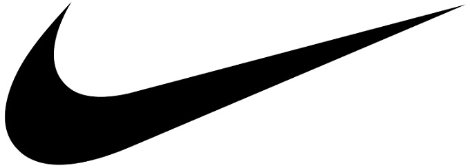
Can you believe that the famous Nike “Swoosh” logo only cost the company $35? The Swoosh logo was designed in 1971 by graphic design student Carolyn Davidson, who was commissioned by a professor who worked for the Blue Ribbon Sports company. The company was creating a new brand of football shoe called the Nike and needed a logo. Davidson spent 17 hours creating a design that would convey the message of clean, swift motion.
The original Swoosh was outlined in black with a transparent center, set behind the word “nike” in black. In 1978, the Swoosh was painted completely black and placed beneath the word, which was changed to all caps. In 1995, the company dropped its name from the logo and all that remains is the $35 Swoosh recognized round-the-world.
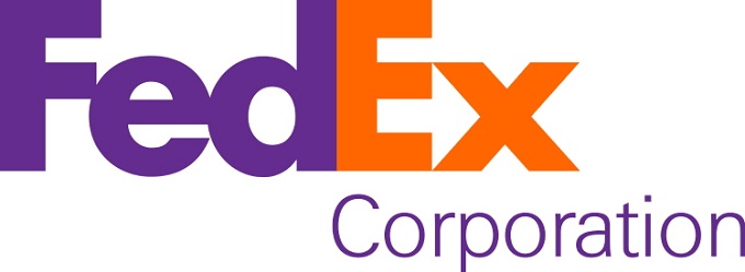
The original FedEx logo was designed in 1971, back when the company went by its full name, Federal Express. These words were featured diagonally inside a blue and white colored rectangle, with the word “Express” colored in red.
In 1994, the company shortened its name to FedEx and the logo was simplified along with it. The new logo was designed by Lindon Leader, who changed the blue to purple and the red to orange. Most importantly, the new FedEx logo is a primary example of how to maximize dead space. The space between the “E” and “x” creates a white arrow, a perfect illustration of the company’s mission. The arrow is made possible due to the specific font Leader chose.
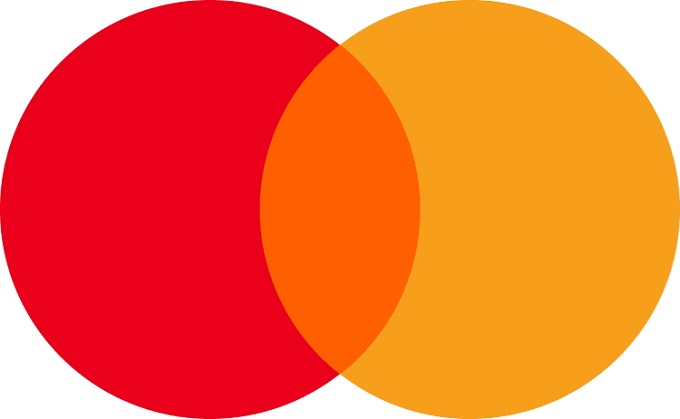
MasterCard was launched in 1967 under the name Interbank Card Association. Its card was named MasterCharge, and in 1968 designers created the now-famous logo with the overlapping circles. In 1979, MasterCharge changed to MasterCard, but the two overlapping circles remained the same.
Since then, the logo has undergone various changes, including the use of different fonts and circle designs. The most notable redesign happened recently in 2019, when the name was ultimately removed from the circles. Indeed, it’s the mark of a company’s international brand recognition when it can drop its name from the logo and leave only the image.

Though the first Mercedes logo was created in 1902, the famous 3-pointed star only made its first appearance in 1909. The 3 points are meant to symbolize the 3 elemental forces: land, air, and sea. Once the company started using the star as its logo, it never stopped. There have been various versions over the years, but in 2008 the company opted for minimalism and got rid of all the frills. What’s left is a monochrome 3-pointed star in the middle of a silver circle. Obviously, that’s all the company needs.

Shell, the famous oil and gas company, was founded in the late 1890s and its logo has undergone many transformations. In 1904 it took the form of a Pecten shell with intricate lines and shading. Red and yellow were added in 1915. The colors were supposedly chosen because they are the colors of the Spanish flag, and Shell’s first service station in California at the time had a large Spanish population.
Over the course of many decades, the logo underwent many subtle changes. The main overhaul came in 1971. The new logo was designed by Raymond Loewy, and it is the simplified red and yellow shell that we know today. The name Shell was written beneath the symbol, but in 1999, the word Shell was tossed. Today we only need to look at the brightly colored shell to know what company it signifies.
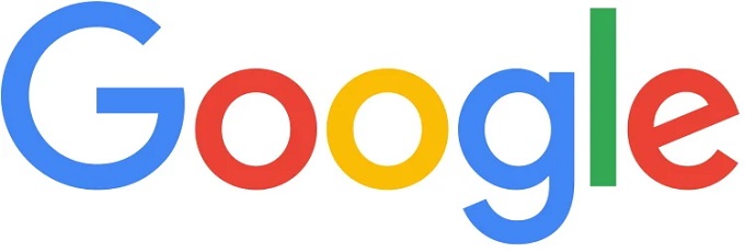
Sergey Brin, cofounder of Google, created the company’s first logo in 1998 using the free graphics program, GIMP. The colors were bright and Brin added an exclamation point to mimic the main competitor at the time, Yahoo! In 1999, the cofounders hired Stanford assistant professor Ruth Kedar to modify the logo. She changed the font and removed the exclamation point. This version lasted until 2010.
Other subtle changes took place until 2015, when Google changed the font again and removed the shadowing from the letters. At the same time, Google created the rainbow “G” logo, which is used on smartphones to represent the app. Of course, there are also the famous Google Doodles, which are designed for special occasions by a team of specialized “doodlers.”
The brand logos described above are as different from each other as night and day. And yet, they’ve all achieved wild success, with people around the world recognizing them instantly. While there’s no formula for this type of acclaim, one thing that most of the logos do have in common is simplicity. In fact, most of them started out more complex and intricate, and almost all eventually dropped the embellishments in favor of sleek and simple design. In the case of the top 10 iconic brand logos, less is certainly more.
You may also like:
Elana Kutscher is a seasoned digital enthusiast who writes for Top10.com. She has hands-on knowledge of software and online platforms, having collaborated on multiple projects with leading tech firms.